Ok, I'm not sure of the graphics of the final game and all, however, there are several feedbacks about the Visuals of the game that I felt it is quite important to point out upon trying out Alpha:
First and foremost, I would like to humbly critique, would be the Interface Design and the Colours used in there. Personally, felt that the overall impression of it is quite bad because the Blue that is used in there is quite old fashion and doesn't really match the futuristic feel? Perhaps it is because there are too much solid elements in the UI and too little "Transparent" borders and such, that gives the overall outlook of it a very dull and heavy appearance.
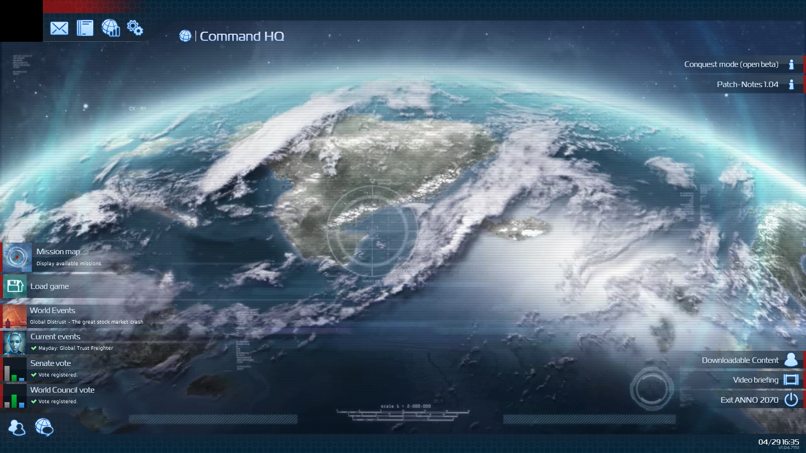
I would humbly suggest the designers of this aspect to explore the overall Interface and Design of the overall Interactive Elements (such as mouse pointers, buttons, maps, etc) from games like EVE and Anno 2070. here is an image that I would like to share from Anno 2070 to express what I meant by a Dynamic "Futuristic" feel with "Soft edges".
Secondly, upon starting the game, I realized that the Fog of War and the overall "Command Interface", really felt primitive. The background of the universe looks really artificial and the positioning of the stars are too messy and quite unsightly.
The Hex Grid and the Fat arrows that marks the path of the Oversize Ships are really unnecessary and they kinda destroy the feeling of being a Inter-galactic Commander, but rather a Chess Player. Perhaps the range of each ship could be indicated with opaque spheres or circles and the arrows thin and grey instead of gradients of primary colours.
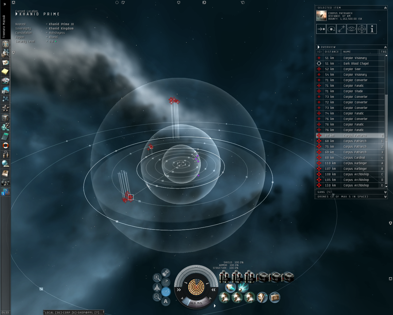
To better express what I mean by a better Map Interface design, here is another Image of EVE Online that could express what I'm trying to say here.
Overall, what am suggesting here as an Elite Founder, is to overhaul the entire Interface Design into something Softer, with more three dimensional icons and mouse pointers that animates, revamp of the usage of Fonts with the right amount of spacing between letters, and update the existing colour scheme with more a Contemporary palette.
I hope that my suggestion is seen as a sincere feedback as well as a constructive criticism with an objective of enhancing the game.
Honestly, the potential of this game is really great, especially with the one of its kind mechanics and all. To be honest, I admit that I am an Eve Online Fan and decided to get this game after playing Sins of a Solar Empire, as well as upon learning the potentially awesome game mechanics.
However, the existing presentation of the Interface is really a let down and does the game no justice. It is not worth risking potential new players who were not fans before to deny a chance to play and appreciate the game in-depth, just because the overall feel of the Interface is "uncomfortable" and "obsolete"...
